Comparison
Results 1 to 13 of 13

Thread: Comparison

  1. #1

    Comparison

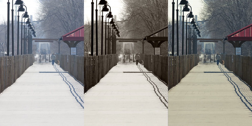
    Instead of taking a photo for the 365 project today, I ended up posting a comparison shot. On the left is the original shot, the middle is Tracon's edit, and the one on the right is mine.


    The higher resolution version is here: http://farm5.static.flickr.com/4067/...b0f87d3c_o.jpg

    What do you guys think? Which edit is more effective? Which do you like more? What would you have done differently?

    I learned a lot from doing this with Tracon tonight. A lot more than taking a photo of some random object in my house.

  2. #2
    Banned
    Join Date
    Oct 2009
    Location
    A Farm in Nebraska
    Age
    37
    Posts
    254
    Blog Entries
    1
    I'm partial to the far right edit.

  3. #3
    Retired SOH Administrator
    Join Date
    Mar 2008
    Location
    Sunshine State
    Posts
    5,128

    It depends on what are you trying to achieve Will!

    The original shot looks like it is a foggy morning or afternoon walk... I like the capture of the fog in a distance...

    Tracon's edit looks like he wanted to show a older photograph....

    And your edit, you wanted the picture more crisp, showing more detail on the walkway, the fence, the light post and the roof...

    ... just my 2 cents...

    Will I do something different?

    Maybe not... Maybe yes....

    I will probably focus on the lines showing more of the left side of the subject, emphasizing on the left fence and taking the alignment of the light post...

    Your chosen subject is very good.... "the Path"...

    I like it!

    ...You know, we have our own individual talent and yours is a good one, there is no right or wrong, it is your style... and your style is just right... you will see a great difference as you go along your hobby - photography... even an ugly subject becomes beautiful with the lens....


    ...Keep up the good work....

    Your grade is an A....

    Chacha


    [SIGPIC][/SIGPIC]

  4. #4

    Lightbulb

    Yes, IMHO depends on what you want....

    That being said, I like the middle one most....

  5. #5
    Charter Member 2015
    Join Date
    Nov 2007
    Location
    off the shoulder of Orion
    Posts
    4,026
    The middle one for me too, although the one on the right looks okay too...just doesn't stand out as much. The image on the left looks as though the white balance is off.

    I just checked the exif and it was shot in Auto WB. Sometimes the camera can get confused in Auto but it's not a huge problem as you can easily fix it in post processing if you shoot in RAW.
    I fly because it releases my mind from the tyranny of petty things — Antoine de Saint-Exupéry

  6. #6
    Quote Originally Posted by kilo delta View Post
    I just checked the exif and it was shot in Auto WB. Sometimes the camera can get confused in Auto but it's not a huge problem as you can easily fix it in post processing if you shoot in RAW.
    Yup, and that's just another reason I shoot RAW all the time. It's awesome. RAW is sooooooooooo much better than jpeg. However it does take a lot more time in PS/ACR.

    Woohoo, we've hit 1000 posts in the photography section. Looks like it's successful so far!

  7. #7
    I think it looks good monochrome, but the walkway is super bright and sort of takes over the whole frame. Maybe a layer mask on the walkway to individually darken and increase the contrast would work.

  8. #8
    Banned
    Join Date
    Oct 2009
    Location
    A Farm in Nebraska
    Age
    37
    Posts
    254
    Blog Entries
    1
    I agree about the middle photo edit and the walkway being too bright. If William revisits his photo I might try to re-do my edit with a layer mask as you mentioned =)

  9. #9
    Not trying to be imposing, I was just playing around with it myself and figured I'd share.

    Check it out...
    Attachment 1564
    Attachment 1564

    I created a new "black and white" adjustment layer and messed with the levels until the contrast looked right.

    Then I created a "channel mixer" adjustment layer to adjust some more (the photo is very blue). I used the soft light blending mode and around 50% opacity.

    Next, I created a "brightness and contrast" adjustment layer. I just used magic wand to select the bright area, then inversed the selection and dumped it black. I softened the edges (kinda sloppily ) with a softer brush and then cut the brightness all the way down and the contrast all the way up. I played with the opacity till it looked right (around 73%).
    :ernae:

  10. #10
    Well both the processed versions are more appealing to me than the original. I guess it's a toss up for me which I like better though with the possible exception that I like the contrast in the trees in the 2nd one better. The detail in that area is better to me.

  11. #11
    Banned
    Join Date
    Oct 2009
    Location
    A Farm in Nebraska
    Age
    37
    Posts
    254
    Blog Entries
    1
    Are you a wildlife guy?

  12. #12
    Happiness Consultant
    Join Date
    Jun 2005
    Location
    Take your best guess
    Posts
    7,121
    Quote Originally Posted by Tracon View Post
    Are you a wildlife guy?
    No. His wife sees to that! LOL!
    "Trust no man living with power to endanger the public liberty!" John Adams 1772

    Snuffy / Ted

  13. #13
    Quote Originally Posted by Tracon View Post
    Are you a wildlife guy?
    Who, me? I don't think I concentrate on one particular thing.

Members who have read this thread: 0

Bookmarks

Posting Permissions

  • You may not post new threads
  • You may not post replies
  • You may not post attachments
  • You may not edit your posts
  •